When it comes to branding and design, colours play a role far more important than simply aesthetics. Each colour has its own interpretation and meaning. By using the right colour combination we can set specific moods and evoke certain emotions. Additionally, we can encourage actions and ultimately create the right impressions.
There is a psychology behind each colour, and it is valuable to understand how to use them to our advantage. Colours in branding have a goal to present our brand, values and send the messages we want to.
Having said that, let’s take a look at meanings of colours and what effect they have in branding and marketing. If you have an established brand, this can help you check if your brand colours match your brand mood.
RED – passion, desire, love, dynamic, energy

The red colour is associated with strong emotions like love and anger and universally used to indicate danger, power, strength, courage.
Add it as part of your branding colour palette if you want to give your brand personality traits of being passionate and bold, strong, powerful.
It is a stimulating, vibrant and exciting colour and for that reason, if used too much it can be overwhelming and off-putting. Moreover, it can also be seen as a warning.
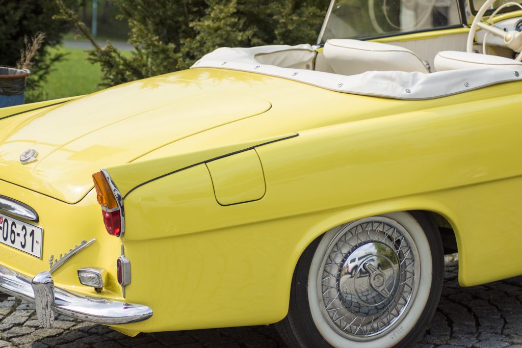
YELLOW – cheerful, joyful, happy, innovative

The vibrancy of yellow colour is perfect for giving the brand the attributes of being happy, confident, energetic. Because of its brightness and intensity, it is very eye-catching and thus often used for call-to-actions. However, be careful not to overuse it as it can be visually heavy for eyes.
ORANGE – optimistic, energizing, friendly, exciting

Similarly to yellow, orange is an energetic colour that is giving a positive, confident, approachable feel.
You will find this colour in brands that want to come across as social, playful and friendly.
Orange is usually playing the role of attention-grabbing colour, and the good thing is that it is less likely it will be overwhelming.
BROWN – honest, wholesome, rustic, confident

Brown is used for expressing organic, rustic emotions and communicates the reliable, rooted brand. Depending on the tone, it can also create an earthy, warm mood that gives the audience a sense of trustworthy and approachable brand.
Light brown tones are more neutral and even though you need some neutral colour in your palette, be careful not to emphasize it too much or it might seem monotonous.
GREEN – freshness, prosperity, balance, growth

The first association when we see this colour is nature, which is why we use it to represent brands as harmonious and tranquil.
It’s the unavoidable colour for brands that want to focus around health, balance and harmony.
BLUE – calmness, patience, loyalty, peace

There is something about blue colour that makes us unwind and become peaceful. It stimulates values like loyalty, credibility, stability while at the same makes us feel serene.
Blue is a favourite in the travel industry, as it evokes the sky and oceans. However, be careful with your choice of the blue though, as some can feel too cold and distant.
PURPLE – luxury, sophistication, spirituality, relaxation

Resulting from a combination of blue and red, calmness and energy, the reason why purple has been referred to as a symbol of royalty is historic, dating back to the times when the cost of dye was so high only members of royalty were able to afford it.
Nowadays it’s also a symbol of extravagance, luxury.
Thus, if mindfulness, peace, mystery, wealth are part of your brand identity than purple should be part of your colour palette.
PINK – feminine, nurturing, delicate, romantic

Traditionally, pink is associated with the feminine or girly, which is why this colour is most used by female-centred brands. In recent times, this association is facing something of a backlash, however.
The vibrant shades of the pink stand for playful, youthful energy while soft pink tones are nurturing, delicate, relaxing.
Pink is also a great impactful colour. Shocking pinks have been used from punk aesthetics through to contemporary apps and startups, taking advantage of the brightness and stand out qualities of pink.
WHITE – clean, airy, minimal, simple

White colour serves as a reminder that there is beauty in simplicity. Use it if you aim to give your brand bright and airy touch or communicate minimalism and cleanliness.
It is sometimes referred to as “the colour of perfection”.
BLACK – elegant, classic, mysterious, sophisticated

Black can lend a sophisticated and classy feel.
The fact that black colour frequently has a negative connotation in real life gives an additional edgy and bold vibe to the brand.
Also known as “the colour of mystery”, it communicates power, confidence, elegance and can look incredibly sleek.
I hope this overview of colours in branding can help you in building your brand identity. If you are curious to dig deeper learn more about colours from a different, historic perspective, I warmly recommend The Secret Live of Colours by Kassia St Clair.
What colours are part of your brand identity colour palette? Let me know in the comments and don’t hesitate to reach out for any questions!
Until next time,


Like!! I blog quite often and I genuinely thank you for your information. The article has truly peaked my interest.
Thank you for taking the time to leave such a nice comment! I’m very happy to hear you’ve found the article useful.
We publish new articles every week so make sure to check them out as well! 🙂